The median is an important quantity in data analysis. It represents the middle value of the data distribution. Estimates of the median, however, have a degree of uncertainty because
(a) the estimates are calculated from a finite sample
(b) the data distribution of the underlying data is generally unknown
In this blog, we will talk about degree of uncertainty for different quantiles.
Order Statistics
in ascending order
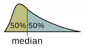
median: = smallest x such that
Let’s begin with a sample of N=200 from the standard normal distribution.
Assume that the 100th order statistic is approximately the median
Density Function for median
The density function for X(k) is
Apply this formula, we can get a plot of density and median
dorder <- function(x){
  100*
  choose(200,100)*
  (pnorm(x))^(100-1)*
  (1-pnorm(x))^(200-100)*
  dnorm(x)
}

curve(
    dorder(x)
  , -0.5
  , 0.5
  , xlab = parse(text="X[(100)](median)")
  , ylab = "Density"
  , main = "Density for Median"
)
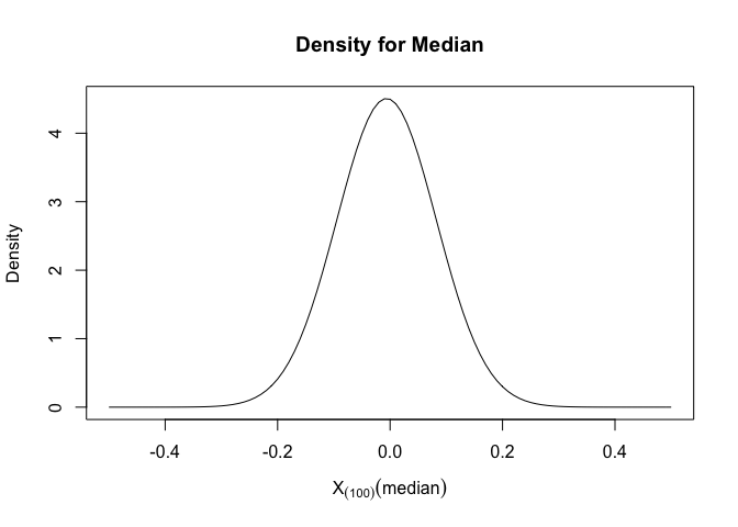
We could see that the median would mainly fall between (-0.2,0.2) and maximum density of median is 0, which is also the theoretical median for standard normal distribution.
Cumulative Distribution Function (CDF) for median
The CDF for X(k) is
Apply this formula, we can get a plot of CDF and median
porder <- function(x){
  pbinom(100-1, 200, pnorm(x), lower.tail = FALSE)
}
curve(
    porder(x)
  , -0.5
  , 0.5
  , xlab = parse(text="X[(100)]")
  , ylab = "Probability"
  , main = "Probability for Median"
)
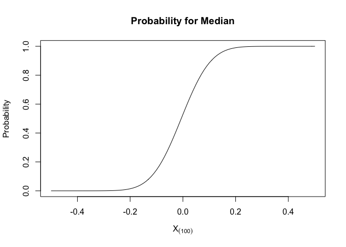
we could see that 90% of median would fall between (-0.2,0.2)
Quantile Function for median
use the uniroot function, we could get the quantile for different probability.
qorder <- function(p){
  out<-p
  for (i in seq_along(p)){
    out[i] <- uniroot(function(x){porder(x) - p[i]},c(-100,100))$root
  }
  out
}

p<-seq(0.05,0.95,by=0.01)
plot(p,qorder(p),type="l",ylim=c(-2,2),ylab="Quantile",lwd=3,main = "Quantile for Median")
lines(p,qnorm(p),col="red",lwd=3)
legend("topleft",c("Median","Normal"), col = c("black","red"), lwd = 3, bty = "n")
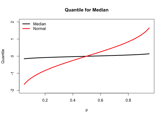
The quantile plot for median is less steeper than the quantile plot for standard normal distribution since 90% of median would fall between (-0.2,0.2).
ECDF & CDF
The empirical cumulative density function
Let XN = X1, X2, …, XN $\text{ecdf}(x, \boldsymbol{X}_N) = \frac{1}{N}\sum_{i=1}^NI(X_i \leq x)$
Let’s take the median of sample with size 200 and repeat this process 5000 times.
| simulation | median |
|---|---|
| 1 | |
| 2 | |
| 3 | |
| … | |
| 5000 |
M <- 5000 # studies
N <- 200 # sample size
sample <- array(rnorm(M*N, 0, 1), c(M, N))
medians <- sample %>% apply(1,median)
plot(ecdf(medians), xlab = parse(text = "CDF~median"), main = "")
curve(porder(x), lwd = 3, add = TRUE, col = "blue")
legend("topleft",c("SIM","Theoretical"), col = c(1,4), lwd = 3, bty = "n")
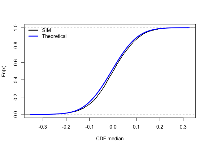
The black line is the CDF by simulation(ECDF) for medians and the blue line is the analytical CDF for medians. For 5000 simulations, the ECDF is almost identical to theoretical cdf.
EPDF & PDF
Let’s take the median of sample with size 200 and repeat this process 5000 times, then create a histogram and overlay the histogram with a plot of the density function.
M <- 5000 # studies
N <- 200 # sample size
sample <- array(rnorm(M*N, 0, 1), c(M, N))
medians <- sample %>% apply(1, function(x){sort(x)[100]})
hist(medians, breaks = 100, freq = FALSE)
curve(dorder(x), lwd = 3, add = TRUE, col = "blue")
legend("topleft", c("epdf","pdf"), lwd = 3, col = c("black","blue"), bty = "n")
box()
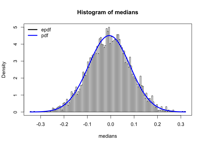
This is the histogram for the simulated medians. The blue line is the plot of the density function of medians.We can see that epdf matches the pdf fairly well so the ordered staistic approach to get the distribution of medians is accurate.
QQ plot
Now let’s use QQ plot to compare a random sample to a theoretical candidate distribution.
p <- ppoints(200)
M <- 5000 # studies
N <- 200 # sample size
sample <- array(rnorm(M*N, 0, 1), c(M, N))
medians <- sample %>% apply(1, function(x){sort(x)[100]})

x <- qorder(p)
y <- quantile(medians, probs = p)

#svg("./assets/exponential-qq.svg", width = 5, height = 3)
#tgsify::plotstyle(style = upright)
plot(x,y,asp=1,xlim=c(-0.5,0.5),ylim=c(-0.2,0.2),xlab="Theoretical quantile",ylab="Sample quantile")
abline(0,1)
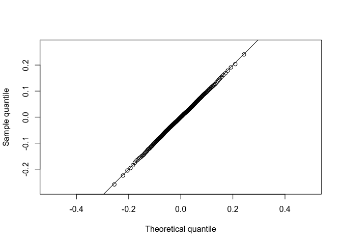
Plot simulated data of the median on the y axis and the known sampling distribution of the median on the x aixs.
The plotted points fall along the line y=x, approximately. Thus, sample and theoretical quantiles come from the same distribution. The simulated data agree with the theoretical sampling distribution.
kt**h order statistic
We have written the dorder, porder, and qorder functions for the median. Now, let’s modify these functions, taking a new parameter k (for the kt**h order statistic) so that the functions will work for any order statistic and not just the median.
dorder <- function(x,k){
  k*
  choose(200,k)*
  (pnorm(x))^(k-1)*
  (1-pnorm(x))^(200-k)*
  dnorm(x)
}
porder <- function(x,k){
  pbinom(k-1, 200, pnorm(x), lower.tail = FALSE)
}
qorder <- function(p,k){
  out<-p
  for (i in seq_along(p)){
    out[i] <- uniroot(function(x){porder(x,k)-p[i]},c(-100,100))$root
  }
  out
}

p<-seq(0.05,0.95,by=0.01)
Adding distributions and other parameters
dorder
dorder <- function(x,k,n,dist="norm",...){
  # use get function to transfer character to function
  pf <- get(paste0("p",dist))
  df <- get(paste0("d",dist))
   k*
    choose(n, k)*
    pf(x, ...)^(k-1)*
    (1-pf(x, ...))^(n-k)*
    df(x, ...)
}
porder
porder <- function(x, k, n, dist = "norm", ...){
  pf <- get(paste0("p", dist))

# Slide 54 of transformations & order-statistics
  pbinom(k-1, n, pf(x, ...), lower.tail = FALSE)
}
qorder
qorder <- function(p, k, n, dist = "norm", ...){
  out <- p
  for(i in seq_along(p)){
    out[i] <- uniroot(function(x){porder(x, k, n, dist, ...) - p[i]}, c(-100,100))$root
  }
  out
}
Maximum
N <- 200
M <- 5000
out <- array(rnorm(M*N), c(M,N))
maxs <- apply(out,1,max)

p <- ppoints(200)
x <- qorder(p, 200, 200)
y <- quantile(maxs, probs = p)

#svg("./assets/max-qq.svg", width = 5, height = 3)
#tgsify::plotstyle(style = upright)
plot(x,y, asp = 1, xlab = "Theoretical quantile", ylab = "Sample quantile")
abline(0,1)
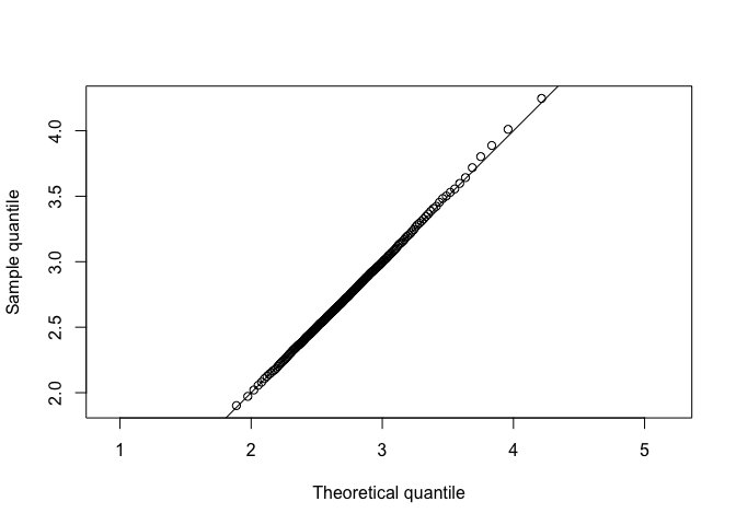
Plot simulated data of the median on the y axis and the known sampling distribution of the median on the x aixs.
The plotted points fall along the line y=x, approximately. Thus, sample and theoretical quantiles come from the same distribution. The simulated data agree with the theoretical sampling distribution.
Minimal
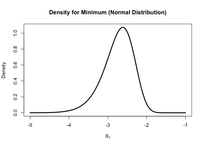
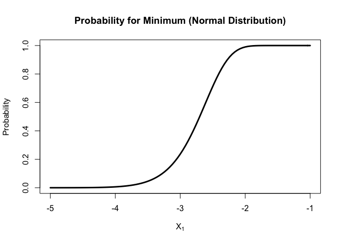
Let’s use the newly modified functions to plot the probability and density functions for the sample min (N = 200) of standard normal distribution
curve(
  dorder(x, k=1, n=200, dist = "norm")
  , xlim = c(-5, -1)
  , xlab = parse(text = "X[1]")
  , ylab = "Density"
  , lwd = 3
  , main = "Density for Minimum (Normal Distribution)"
)
curve(
  porder(x, k=1, n=200, dist = "norm")
  , xlim = c(-5, -1)
  , xlab = parse(text = "X[1]")
  , ylab = "Probability"
  , lwd = 3
  , main = "Probability for Minimum (Normal Distribution)"
)
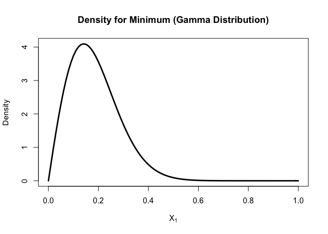
Now let’s plot the probability and density functions for the sample min (N=200) of gamma distribution
curve(
  dorder(x, k=1, n=200, dist = "gamma",shape=2,scale=2)
  , xlim = c(0,1)
  , xlab = parse(text = "X[1]")
  , ylab = "Density"
  , lwd = 3
  , main = "Density for Minimum (Gamma Distribution)"
)
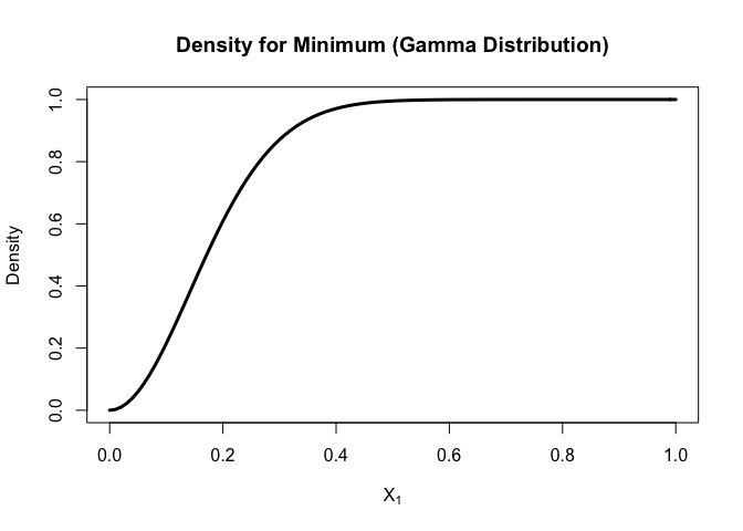
curve(
  porder(x, k=1, n=200, dist = "gamma",shape=2,scale=2)
  , xlim = c(0,1)
  , xlab = parse(text = "X[1]")
  , ylab = "Density"
  , lwd = 3
  , main = "Density for Minimum (Gamma Distribution)"
)
For normal distribution,
unlike the median, the density function for minimal is not symmetric, but still in a bell shape. Most of minimal fall between (-4,-2).
For gamma distribution,
the density will increase from 0 and then decrease and most of minimal fall between (0, 0.4).
Conclusion
Different order statistics have different pattern for density functions and probability functions.
The sample distributions fitted the theoretical values well for median and maximum. We could generate QQ plot for other ordered statistic as well and see which quantile gives more precision.