Background
Quantiles are cut points dividing the range of a probability distribution into continuous intervals with equal probabilities, or dividing the observations in a sample in the same way. Estimates of a range of quantiles have a degree of uncertainty because:
- the estimates are calculated from a finite sample
- the data distribution of the underlying data is generally unknown.
In this blog, let’s talk about the degree of uncertainty in data analysis. We will cover normal distribution, exponential distribution and mixed distribution.
sample=rnorm(5000,0,1)
p=seq(0.05,0.95,0.05)
quantile=quantile(sample,probs=p)
plot(p,qnorm(p),type="b",xlab="percentage",ylab="quantile")
lines(p,quantile,type="b",col="red")
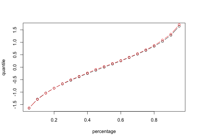
The red line is from sampling, and the black line is the real number for normal distribution. We can see that there is some variation for different quantiles. For which quantiles of a continuous distribution, can we estimate with more precision?
Standard Normal Distribution
Let’s start from normal distribution with mean 0 and standard deviation 1
First let’s set 19 quantiles, from 0.05 to 0.95, with break 0.05
For each simulation, we take a random samples of size 200 and calculate these 19 quantiles
Run the simulation 10000 times and store all the outputs in a matrix
| simulation | 0.05 | 0.1 | 0.15 | … | 0.95 |
|---|---|---|---|---|---|
| 1 | |||||
| 2 | |||||
| 3 | |||||
| … | |||||
| 1000 |
We are curious about the variation of a range of quantiles. Thus, for each quantile, we calculate the length of the middle 95% of the sampling distribution by calculating the difference between 2.5% and 97.5% percentiles of each column.
quantiles_normal=matrix(NA,nrow=10000,ncol=19)
for (i in 1:10000){
sample_200=rnorm(200,0,1)
for (j in 1:19){
quantiles_normal[i,j]=quantile(sample_200, probs = 0.05*j)
}
}
normal.mid.lengths=rep(NA,19)
for (i in 1:19){
  normal.mid.lengths[i]=quantile(quantiles_normal[,i], probs = 0.975)-quantile(quantiles_normal[,i], probs = 0.025)
}
Here is the plot for length and pt**h quantile
p=seq(0.05,0.95,0.05)
df_normal=data.frame(p,normal.mid.lengths)
ggplot(df_normal,aes(x=p,y=normal.mid.lengths))+geom_line()+labs(x="pth quantile",y="Length",title="Length of middle 95% of sampling distn")+theme(plot.title = element_text(hjust = 0.5))
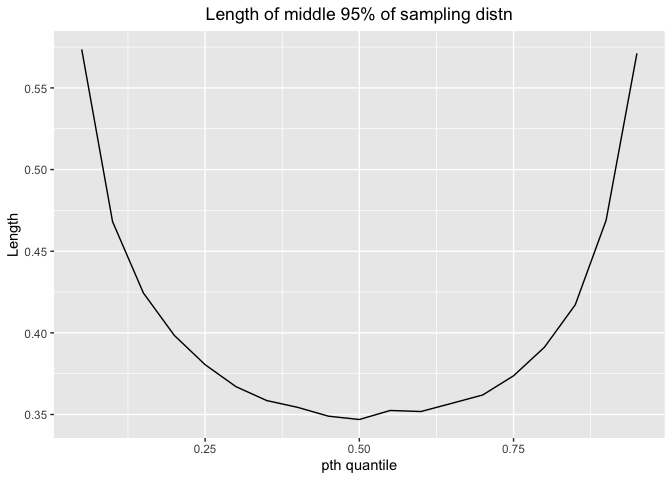
The length would decrease first and then increase. The shortest length comes at 0.25-0.75 percentile, indicating 25%-75% percentile has more precision.
Next, let’s take transformation of the x-values from percentiles to density.
This is the process for transformation: probability–> quantile –> density
Density measures how often we observe these points.
Here is the plot for length and density
ggplot(df_normal,aes(x=dnorm(qnorm(p)),y=normal.mid.lengths))+geom_point()+labs(x="Density",y="Length",title="Length of middle 95% of sampling distn by density")+theme(plot.title = element_text(hjust = 0.5))
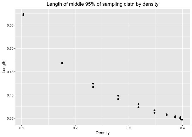
We can see that as density increases, the length would decrease. So we can estimate with more precision when the number are more likely to appear in the distribution. It is consistent with our conclusion in the first plot.
Let’s look at the graph for normal distribution
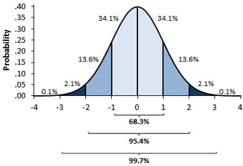
Since it is symmetric, there would be two points with similar length. We can estimate with more precision when the number is closed to the mean, that is, around 50% percentile, which have large density.
Exponential Distribution with rate = 1
quantiles_exp=matrix(NA,nrow=10000,ncol=19)
for (i in 1:10000){
sample_200=rexp(200,rate=1)
for (j in 1:19){
quantiles_exp[i,j]=quantile(sample_200, probs = 0.05*j)
}
}
exp.mid.lengths=rep(NA,19)
for (i in 1:19){
  exp.mid.lengths[i]=quantile(quantiles_exp[,i], probs = 0.975)-quantile(quantiles_exp[,i], probs = 0.025)
}
Here is the plot for length and pt**h quantile
p=seq(0.05,0.95,0.05)
df_exp=data.frame(p,exp.mid.lengths)
ggplot(df_exp,aes(x=p,y=exp.mid.lengths))+geom_line()+labs(x="pth quantile",y="Length",title="Length of middle 95% of sampling distn")+theme(plot.title = element_text(hjust = 0.5))
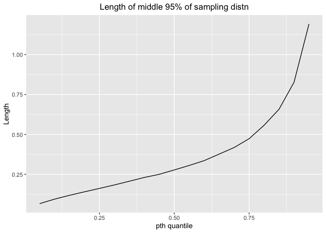
The length would increase as p increases. Thus, we can estimate with more precision for small percentile.
Next, let’s take transformation of the x-values from percentiles to density.
Here is the plot for length and density
p=seq(0.05,0.95,0.05)
ggplot(df_exp,aes(x=dexp(qexp(p)),y=exp.mid.lengths))+geom_line()+labs(x="Density",y="Length",title="Length of middle 95% of sampling distn by density")+theme(plot.title = element_text(hjust = 0.5))
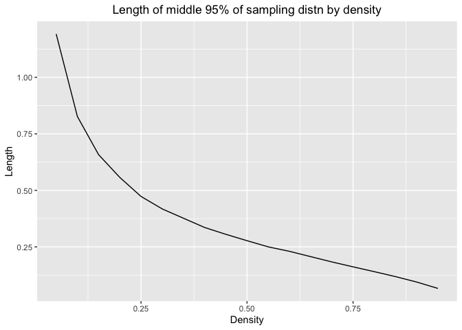
As density increases, the length would decrease. So we can estimate with more precision when the number are more likely to appear in the distribution. It is consistent with our conclusion in the first plot.
Here is the graph for exponential distribution with different rate.
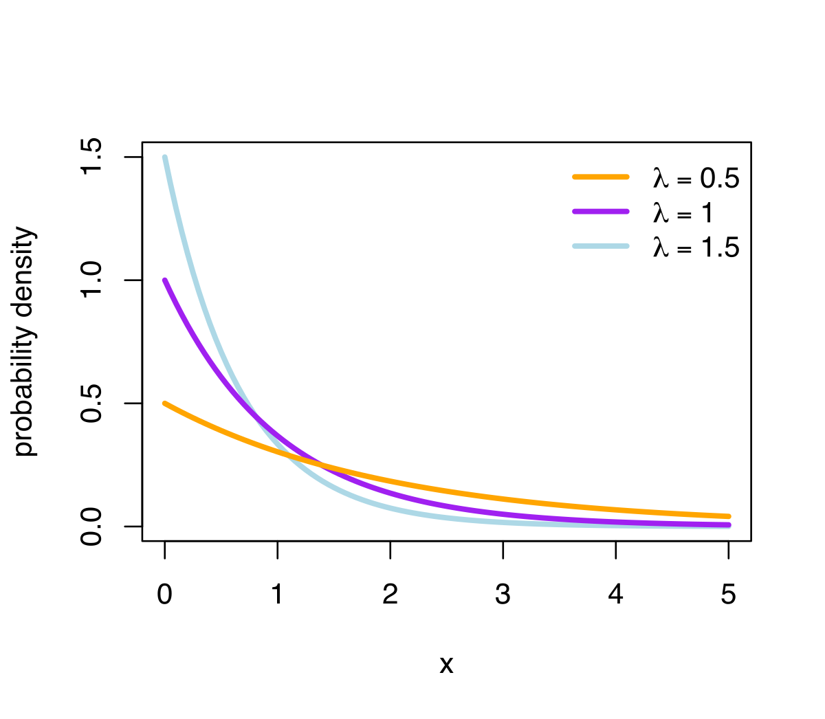
We can estimate exponential distribution with more precision when the number is with small percentile and with large density.
Distribution 3: mix distribution
For mix distribution, we don’t know the data distribution of the underlying data. Let’s talk about mix distribution of normal.
Our assumption for mix distribution is
| Distribution | Probability |
|---|---|
| Normal(0,1) | 0.5 |
| Normal(4,1) | 0.3 |
| Normal(-4,2) | 0.2 |
rf3 <- function(N){
  G <- sample(0:2, N, replace = TRUE, prob = c(5,3,2))
  (G==0)*rnorm(N) + (G==1)*rnorm(N,4) + (G==2)*rnorm(N,-4,2)
}

pf3 <- function(x){
  .5*pnorm(x) + .3*pnorm(x,4) + .2*pnorm(x,-4,2)
}

df3 <- function(x){
  .5*dnorm(x) + .3*dnorm(x,4) + .2*dnorm(x,-4,2)
}
roots<-rep(NA, 19)
#seq(0.05,0.95,0.05)
quantiles_mix3 <- matrix(NA,nrow = 10000,ncol = 19)

for (i in 1:10000) {
  mix3 <- rf3(200)
  for (j in 1:19) {
    quantiles_mix3[i,j] <- quantile(mix3,0.05*j)
  }
}

mix3.mid.lengths <- rep(NA,19)

for (i in 1:19) {
  mix3.mid.lengths[i] <- quantile(quantiles_mix3[,i],0.975)-quantile(quantiles_mix3[,i],0.025)
}

p=seq(0.05,0.95,0.05)
for(i in 1:length(p)){
  pnew<-function(q){
  pf3(q)-p[i]
}

roots[i]<-uniroot(pnew, c(-100,100))[[1]]
}
Here is the plot for length and pt**h quantile
# Prob
df_mix3_1=data.frame(p,mix3.mid.lengths)
ggplot(df_mix3_1,aes(x=p,y=mix3.mid.lengths))+geom_line()+labs(x="pth quantile",y="Length",title="Length of middle 95% of sampling distn")+theme(plot.title = element_text(hjust = 0.5))
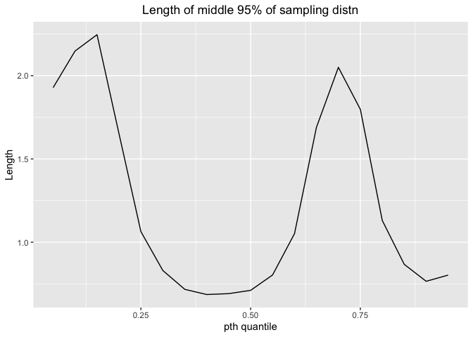
For this mixed distribution, the shortest length comes at 30% - 60% quantile, indicating that we can estimate with more precision at this interval.
Next, let’s take transformation of the x-values from percentiles to density.
Since we can’t get quantile directly from probability. We can use uniroot function in R to solve the quantile for different probability from 0.05 to 0.95. Then use quantile to calculate density.
Here is the plot for length and density
#Density
df_mix3_2=data.frame(df3(roots),mix3.mid.lengths)
ggplot(df_mix3_2,aes(x=df3(roots),y=mix3.mid.lengths))+geom_point()+labs(x="Density",y="Length",title="Length of middle 95% of sampling distn by density")+theme(plot.title = element_text(hjust = 0.5))
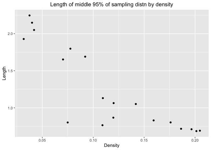
The pattern is same for standard normal distribution and exponential distribution with rate 1. As density increases, the length would decrease. So we can estimate with more precision when the number are more likely to appear in the distribution.
plot(p, df3(roots),xlab="pth quantile", ylab="Density")
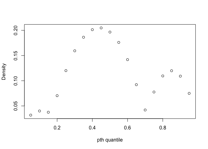
This is the plot of probability and density for this mix distribution. We can see that at 30% - 60% quantile, the density is the largest. Thus, the conclusion for two figures above is consistent, that we could estimate with more precision at 30% - 60% quantile, which have large density.
Distribution 4: mix distribution
Let’s talk about mix distribution of Beta.
This is the pdf for Beta distribution: $f_X(x) = \frac{1}{B(a,b)} x^{a-1}(1-x)^{b-1} \qquad (x \in [0,1])$
Our assumption for mix distribution is
| Distribution | Probability |
|---|---|
| Beta(5,1) | 0.5 |
| Beat(1,5) | 0.5 |
rf4 <- function(N){
  G <- sample(0:1, N, replace = TRUE)
  (G==0)*rbeta(N,5,1) + (G==1)*rbeta(N,1,5)
}

pf4 <- function(x){
  .5*pbeta(x,5,1) + .5*pbeta(x,1,5)
}

df4 <- function(x){
  .5*dbeta(x,5,1) + .5*dbeta(x,1,5)
}
roots<-rep(NA, 19)
#seq(0.05,0.95,0.05)
quantiles_mix4 <- matrix(NA,nrow = 10000,ncol = 19)

for (i in 1:10000) {
  mix4 <- rf4(200)
  for (j in 1:19) {
    quantiles_mix4[i,j] <- quantile(mix4,0.05*j)
  }
}

mix4.mid.lengths <- rep(NA,19)

for (i in 1:19) {
  mix4.mid.lengths[i] <- quantile(quantiles_mix4[,i],0.975)-quantile(quantiles_mix4[,i],0.025)
}

p=seq(0.05,0.95,0.05)
for(i in 1:length(p)){
  pnew<-function(q){
  pf4(q)-p[i]
}

roots[i]<-uniroot(pnew, c(-100,100))[[1]]
}
Here is the plot for length and pt**h quantile
df_mix4_1=data.frame(p,mix4.mid.lengths)
ggplot(df_mix4_1,aes(x=p,y=mix4.mid.lengths))+geom_line()+labs(x="pth quantile",y="Length",title="Length of middle 95% of sampling distn")+theme(plot.title = element_text(hjust = 0.5))
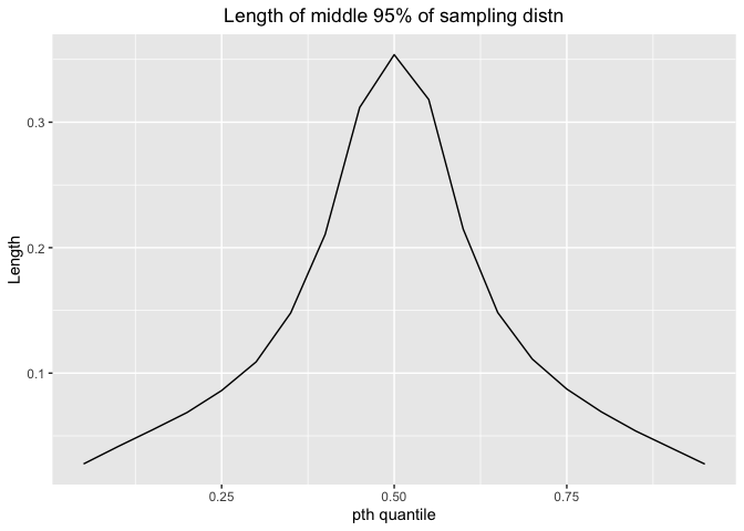
The length would increase and then decrease. Thus, we could estimate with more precision for 0-10% quantile and 90% - 100% quantile.
Next, let’s take transformation of the x-values from percentiles to density
Since we can’t get quantile directly from probability. We can use uniroot function in R to solve the quantile for different probability from 0.05 to 0.95. Then use quantile to calculate density.
Here is the plot for length and density
df_mix4_2=data.frame(df4(roots),mix4.mid.lengths)
ggplot(df_mix4_2,aes(x=df4(roots),y=mix4.mid.lengths))+geom_line()+labs(x="Density",y="Length",title="Length of middle 95% of sampling distn by density")+theme(plot.title = element_text(hjust = 0.5))
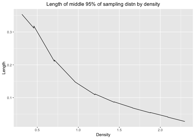
The pattern is the same for all three distribution we talked above. As density increases, the length would decrease. So we can estimate with more precision when the number are more likely to appear in the distribution.
plot(p, df4(roots),xlab="pth quantile", ylab="Density")
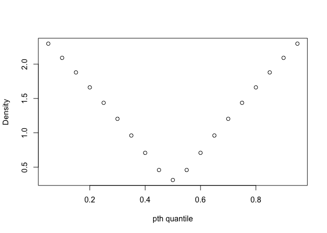
This is the plot of probability and density for this mix distribution. We can see that at 0 - 10% quantile and 90% - 100% quantile, the density is the largest. Thus, the conclusion for two figures above is consistent, that we could estimate with more precision at 0 - 10% quantile and 90% - 100% quantile, which have large density.
Different sample size
We set sample size N to be 200 for these four distributions. Now let’s set it larger for N=400,800,1600. Then see how the length would be for standard normal distribution in terms of different sample size N.
# N=200
quantiles_normal=matrix(NA,nrow=10000,ncol=19)
for (i in 1:10000){
sample_200=rnorm(200,0,1)
for (j in 1:19){
quantiles_normal[i,j]=quantile(sample_200, probs = 0.05*j)
}
}
normal.mid.lengths1=rep(NA,19)
for (i in 1:19){
  normal.mid.lengths1[i]=quantile(quantiles_normal[,i], probs = 0.975)-quantile(quantiles_normal[,i], probs = 0.025)
}

# N=400
quantiles_normal=matrix(NA,nrow=10000,ncol=19)
for (i in 1:10000){
sample_400=rnorm(400,0,1)
for (j in 1:19){
quantiles_normal[i,j]=quantile(sample_400, probs = 0.05*j)
}
}
normal.mid.lengths2=rep(NA,19)
for (i in 1:19){
  normal.mid.lengths2[i]=quantile(quantiles_normal[,i], probs = 0.975)-quantile(quantiles_normal[,i], probs = 0.025)
}

# N=800
quantiles_normal=matrix(NA,nrow=10000,ncol=19)
for (i in 1:10000){
sample_800=rnorm(800,0,1)
for (j in 1:19){
quantiles_normal[i,j]=quantile(sample_800, probs = 0.05*j)
}
}
normal.mid.lengths3=rep(NA,19)
for (i in 1:19){
  normal.mid.lengths3[i]=quantile(quantiles_normal[,i], probs = 0.975)-quantile(quantiles_normal[,i], probs = 0.025)
}

# N=1600
quantiles_normal=matrix(NA,nrow=10000,ncol=19)
for (i in 1:10000){
sample_1600=rnorm(1600,0,1)
for (j in 1:19){
quantiles_normal[i,j]=quantile(sample_1600, probs = 0.05*j)
}
}
normal.mid.lengths4=rep(NA,19)
for (i in 1:19){
  normal.mid.lengths4[i]=quantile(quantiles_normal[,i], probs = 0.975)-quantile(quantiles_normal[,i], probs = 0.025)
}

p=seq(0.05,0.95,0.05)
df_normal=data.frame(p,normal.mid.lengths1,normal.mid.lengths2,normal.mid.lengths3,normal.mid.lengths4)
ggplot(df_normal,aes(x=p))+
geom_line(aes(y=normal.mid.lengths1))+
geom_point(aes(y=normal.mid.lengths1))+
geom_text(aes(x = 0.5, y = 0.38),label = "N=200", color = "black") +
geom_line(aes(y=normal.mid.lengths2),col="red")+
geom_point(aes(y=normal.mid.lengths2),col="red")+
geom_text(aes(x = 0.5, y = 0.28),label = "N=400", color = "red") +
geom_line(aes(y=normal.mid.lengths3),col="blue")+
geom_point(aes(y=normal.mid.lengths3),col="blue")+
geom_text(aes(x = 0.5, y = 0.2),label = "N=800", color = "blue") +
geom_line(aes(y=normal.mid.lengths4),col="darkgreen")+
geom_point(aes(y=normal.mid.lengths4),col="darkgreen")+
geom_text(aes(x = 0.5, y = 0.15),label = "N=1600", color = "darkgreen") +
labs(x="pth quantile",y="Length",title="Length of middle 95% of sampling distn")+
theme(plot.title = element_text(hjust = 0.5))
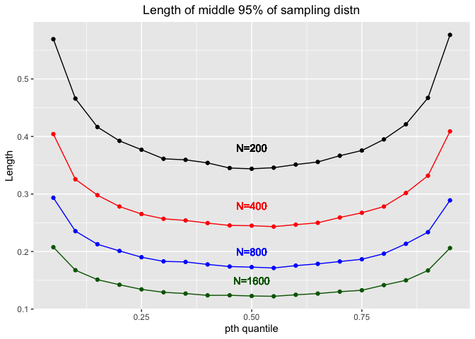
We could see that as N increases, the length would decrease. Thus, we could estimate with more precision when the sample size N is larger.